Network Input & Visualization
In this tutorial, we will explore how to customize and visualize a KSI network using PhosNetVis. Once you have a KSI network from fKSEA page, you can visualize it directly in PhosNetVis. Or, if you have generated the KSI network using another enrichment tool, or would like to customize your KSI network further, this is very easy to do in the Upload Data for Visualization page! Just make sure that your input file adheres to the formatting guidelines for node and edge attributes you would like to customize. Note that PhosNetVis network visualizations are fully flexible, and adaptable to any biomolecular network! You can visualize any two nodes connected by a directed edge, not only kinases and substrates, provided that you label the source and target columns as “Kinase ID” and “Target ID” (e.g. protein, genes, metabolites, etc). This functionality makes our network visualizations adaptable to diverse datasets beyond phosphorylation. You can then visually explore your networks in 2D or 3D, with or without labels. PhosNetVis provides interactive features for visually exploring the network, such as rotating, zooming, panning, and viewing node information. By the end of this tutorial, you will be able to customize any KSI (or other directed) network for better visual exploration and analysis in PhosNetVis. Let’s get started!
Step #1
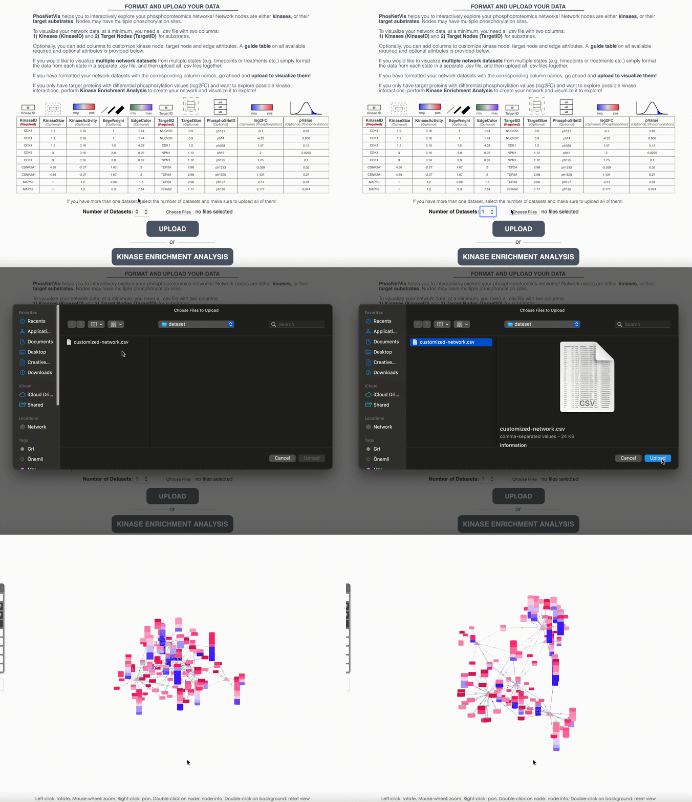
Customize the network: After running fKSEA, you can directly visualize your network in PhosNetVis network visualization page. Alternatively, you can input any KSI or other biomolecular network data as input, provided that you adhere to formatting requirements listed in the Upload Network section. Furthermore, you can add additional customizations of any network by adding additional attribute columns for the network nodes and edges according to the guide table provided below, using a spreadsheet software or by custom scripts on R & Python. The guide table provides information on how to incorporate additional edge and node attributes to your network, based on your needs.

Important Note: In the following steps, we will be using the customized version of the network generated on Tutorial 1 - Fast Kinase Substrate Enrichment Analysis, where edges are randomly colored by adding EdgeHue column to the network. ⬇️ Download Customized Network
Step #2
Upload Networks for Visualization: While fKSEA output can be directly visualized in the network visualization page, if you have a generated the KSI network using another enrichment tool, or customized your network file further, or have more than one network file, you will need to upload the network files for visualization. Enter the number of networks you want to visualize and select these files. After selecting them, click on the “Upload” button to start the visualization process.

Step #3
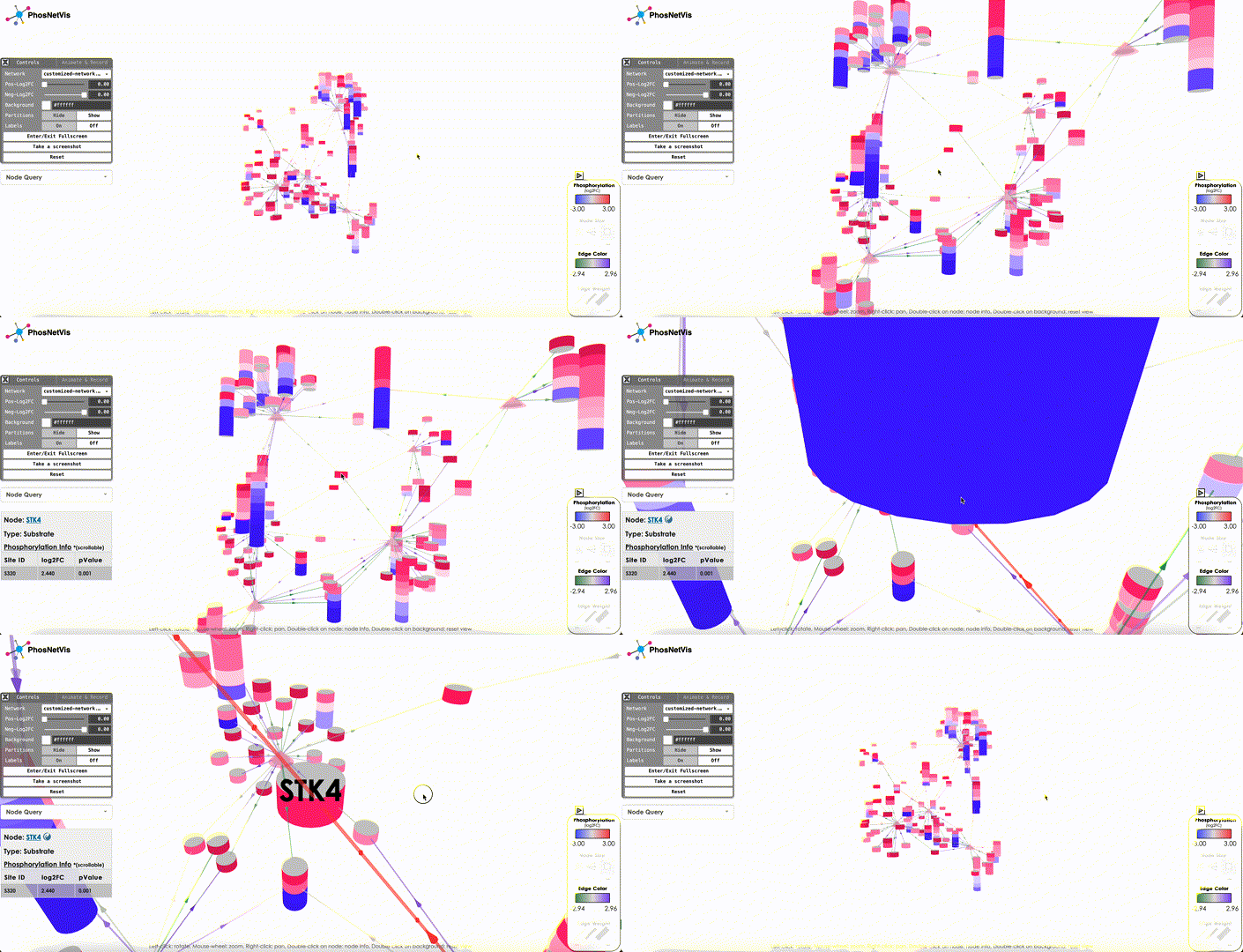
Explore the Network in 3D: Once the networks have been uploaded, they will be visualized using PhosNetVis in 3D. Use Left-click to rotate the network, Mouse-wheel to zoom, Right-click to pan, Double-click on a node to see node information, and Double-click on the background to reset the view.

Step #4
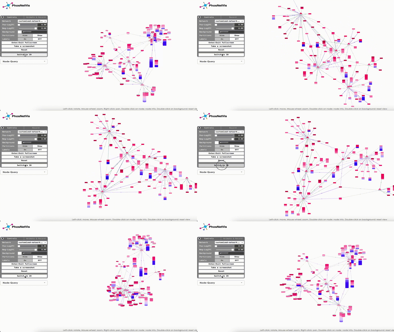
Switch to 2D: Additionally, networks can be visualized in 2D. Simply click on “Switch to 2D” button to visualize your network on 2D. To turn back into 3D visualization, you can click on “Switch to 3D” button.

Final Words
That’s it! With this tutorial, you should now be able to customize and visualize the output of fKSEA analysis for better exploration and analysis of the network. In the next tutorial, we will change use network controls to change background color, node shapes and colors, labels and run a node query to search for a protein of interest! ➡️ Tutorial 3 - Network Controls